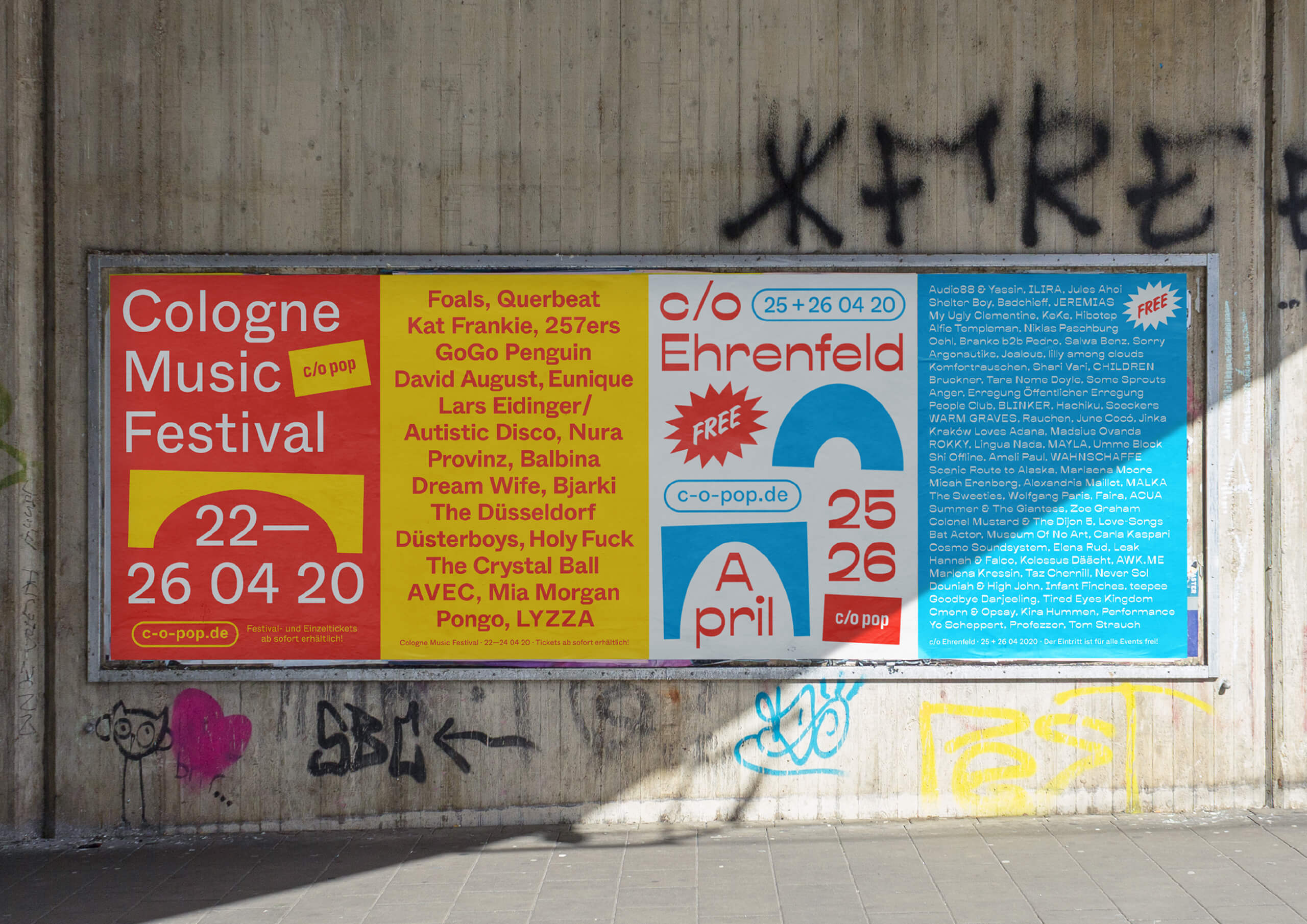


Since 2004 c/o pop Cologne Music Festival has been bringing national and international artists and newcomers from pop, indie, electro, and similar music genres to the city’s stages.
The 2020 edition is the continuation of the festival’s new visual identity, which was initiated last year, in 2019. A modern grotesque typeface, bold color code, and iconic shapes inspired by Cologne’s architectural appearance merge playfully with each other and underline the festival's deep bond with the city. The animation, compression, and expansion of the elements create a dynamic and express the city's lively rhythm and essence.
In addition to the main festival, the appearance for its little sibling and festival-in-a-festival c/o Ehrenfeld was further elaborated. Besides free concerts and shows, c/o Ehrenfeld includes various activities from yoga to workshops, dance, talks, and much more. Its identity follows the visual appearance of c/o pop — the differentiation of color and typeface makes its unique character clear.
The visual identity includes social media and online communication, posters, brochures, branding material, and various festival gadgets in a uniform look and feel.
Due to the corona pandemic, the festival couldn’t take place as originally planned.